Had a gig recently, designing a new logo/brand identity for Different Fur, a recording studio that has been tucked away in a nondescript residential-looking space along 19th Street for something like 40 years. Patrick, the owner (who worked his way up from assistant studio hand), showed me a bunch of examples of styles he liked, some of which he'd pulled out of the New Bohemia Signs Flickr set. He pointed out an old logo of theirs they liked (which you can see atop their website/blog, at least for the time being), but wanted to update, while still keeping something of its deco style. He wanted it to communicate "establishment", the fact that they've been there a long time, and aren't going away. Maybe a little monumental. "Not a hobby", at any rate. I wrote "nondescript" above, but I remember, some years ago, and for I dunno how many years prior, the front door of their white building was emblazoned with a giant stylized barking dog's head. They preferred not to directly reference fur and/or animals anymore.
I did some sketches:

I played around a bit with their old logo, and digitizing some of the sketch ideas:

Meh.
I came up with a letter style I liked, and tried a few permutations of that:
![]()
We met again, for dinner, and talked a bit more in depth, Patrick flipping through my sketch book. We talked about how he'd also like to have a monogram version of the logo, and how he was envisioning some kind of geometric shape involved, maybe a diamond. I played around with that a bit, and sent him these:

But he'd also seen this sketch I'd done for St. Cyprian's church, a few months back, and was curious to see something in a script style:
![]()
So, I drew these, after flipping through that Steven Heller book I'd recently bought, on mid-century modern storefront design:

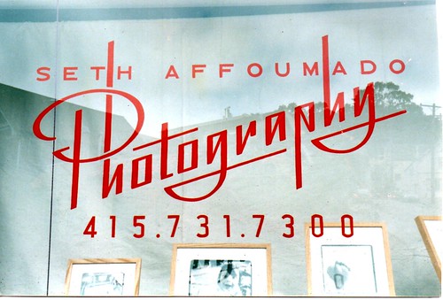
And that last one was a hit! Which, frankly, I found exciting, 'cause I based it 'round this design I did, almost a decade ago, and loved, for a storefront that's unfortunately no longer around:
The other day, I was flipping through a stack of old Kodak prints, looking for a picture of another old sign we'd done, for reference on a different job, and came across this tattered old shot of me painting that sign:

I remember carving a linoleum block from that image, thinking I might block print advertising postcards, but carving the block was about as far as my advertising head of steam got me:

Print your own!
Anyway, back to the matter at hand: I refined my sketch of that last design, scanned it in, and started letter building:

And, bingo, bang-o, long story short, I slapped together some variations, they picked some, and we're done!

I used an existing font for "studios", Union Thug, from Letterhead.
Next, we'll be working on a sign based on this, with some gilding involved. They're having a kind of "coming out" party, next month, once they're (mostly) done remodeling the place, so we needed to have this bit ready for printing invitations and press materials. Voila!