Folk Typography
Convenience. It's one reason hand lettering isn't likely to ever disappear, as well as a reason it's not guaranteed to provide a living wage.
(The image above, pulled from the Flickr Folk Typography pool is one stop, a Creative Commons Attribution Non-Commercial No-Derivative-Works (2.0) image from vistavision's photostream)
Revival Bar & Kitchen transom sign, design process pictorial
Alright, I'm gonna try to this with as many pictures and as few words as I possibly can... (ha!). Ask me a question, if you have any. We just put up a gilded sign over the door at a new restaurant in Berkeley, and here are some sketches leading up to it.
At first meeting, the client mentioned liking old ghost signs, and the look of the Dollar Dreadful website. They already had a make-shift logo, to bide them through their opening weeks, and the only part of it they suggested maybe keeping was the "+" linking bar and kitchen. I sketched some, we talked more, I sketched more...
The simple knotwork motif in the frame of that bottom sketch, was adapted from a sign New Bohemia did for Chow, way back in the 20th century. Anyway, we ended up dropping that, but developed the letter style some more, running the v's through a sharpener, among other things.
At this point, I was hoping maybe to use a font I'd designed a year or so ago, for another job which, as it happens, had fallen through:
But Revival didn't like it much, prob'ly for the same reasons that Curator didn't like it much. Too pointy? They suggested they liked Grant's Antique, from the Letterheads Font shop, and we agreed that the Boston Candies logo on that page was a lot like what they wanted. So, I sketched some more, looking at that, some Dover frame collections, and my copy of Atkinson sign reproductions:
They liked those, and also decided to go with an ampersand, instead of the plus sign. While working on a few takes on the frame I went on a Letterhead Fonts shopping spree, then tried making them fit the sketch shapes, so they could have a printable logo version of the sign.
Eventually, we settled on something, and went out to gild, on Monday.
When I saw the deep overhang above the transom, I decided to put matte centers on "Revival", so it would diffuse more light, and be more visible from positions where the window reflected the dark ceiling. I think it'll look really good in the light of those little marquee bulbs, too.
And here's what it looks like done:
Little City Gardens
Try as we might, we just have the hardest time keeping that scrappy li'l Caitlyn 'round the shop any more than we do. She's always off digging up trouble in her garden, launching political battles about it, then going and telling the New York Times!
(Rather than just teasing Caitlyn on account of her describing herself as "fairly scrappy... and often pretty dirty", I should point out that she has a couple other evocative quotes in the story, too, involving huge jazz and desperate sunflowers)
3 Potato 4
I just learned (or maybe re-learned? I'm so flighty... It's the fumes!), that an old friend, Beth, keeps a blog of those things that twirl her pinwheel in the realms of art and design. She recently posted about the vintage sign offerings from Three Potato Four, an online purveyor of esoteric antiquities, whose site I need to stop perusing, at least long enough to finish writing about. Their home page says "storefront opening soon". No other info than that, about the brick-and-mortar, but I hope I can visit, when I'm back east over the holidays, and up in Philly for a stop at the Mutter Museum...
Besides accumulating stray metal letters and service station price numbers, the odd header card and bus bench sign, they've retained the services of "an accomplished sign painter with 30+ years in the sign-making business", to paint personalized shingles, simply designed, made to order!
I'm totally stealing this idea. I remember Steve Karbo wanting to get something like this going, when he was working here again, last year. Too late now, but I could totally imagine having had a little Karbo-powered sweat shop in the back corner... I'll try and send him a link, if he's still online in his Arkansas hideaway, and maybe he'll get inspired, too. In the meantime, if I ever actually get such an operation going here, we'll only be able to offer 10+ years in the biz...
Ok, Mitch
Tuesday afternoon, we were paid a visit by Dmitry Pankov, from
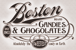
 okMitch Studio, the mural and sign shop in NYC, which he runs along with his partner Angel Saemai. Above, you can see the window they gilded for Brooklyn Circus, in (of all places) Brooklyn, a very refined and elegant counterpart to the window we gilded for Brooklyn Circus, in (naturally) San Francisco. In fact, on their website, you can see a number of lovely examples of hand laid gold on glass. They, too, have recently decorated a Napoletana-style pizzeria.
There's a bit of a difference, in that they don't seem to do much hand-lettering, except in wall mural applications. If you click through to their Brooklyn Circus photo set, you can see some shots with the stencil adhered to the glass, and the gold laid over top. Ken and I were just talking this morning about the process of silk screening back-up paint behind the gold, handy particularly for doing repeated gilds across multiple windows (as seen while driving past the Absinthe Bar, in Hayes Valley), and this looks like another fine method for keeping things regular, in print making fashion.
I haven't actually done it either of those ways, myself. I'm not especially compelled to, nor am I put off by it, so long as they're well-designed signs, in the end. I mean, I could turn up my nose at all the mechanical intervention, but really, I use the same machines to produce a lot of the patterns we use in our own signs. Not having a stencil makes it a bit harder to stay inside the lines, true, but regardless, I'm glad people are still hand laying gold leaf on glass, however they go about backing it up. As I tell clients, the nicest thing about gilding is, when the sign is done, it looks like gold. I'm also glad that now I've met someone in NYC who I can recommend to the folk who occasionally call or write, looking for a gilder 'round those parts. And, hey, they'll do murals, too.