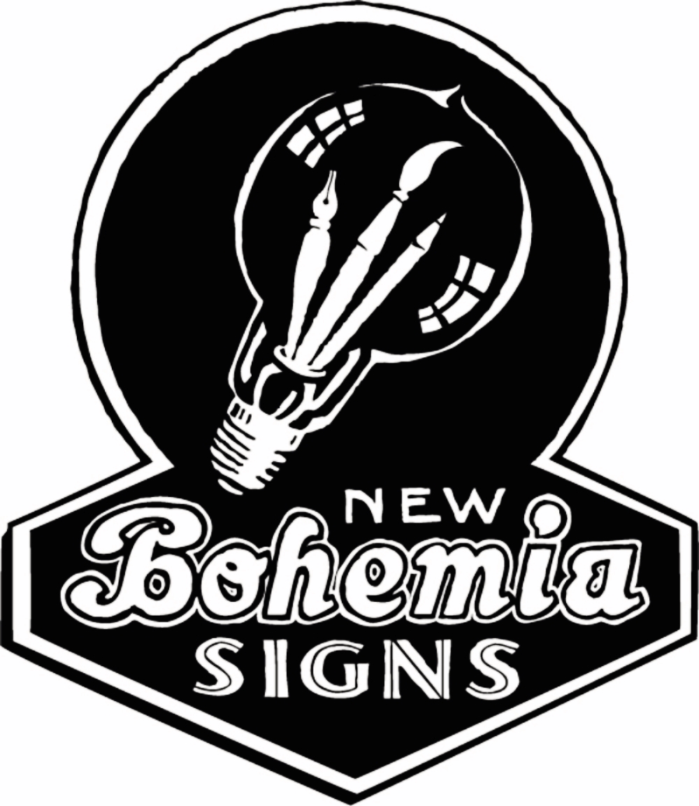
 I'm indulging my compulsion to write
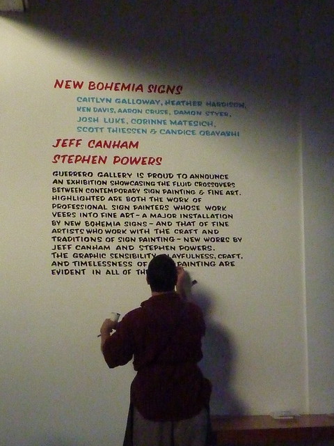
 thoughts about what I painted for the Guerrero Gallery art show. I can't find a way to work much of this into whatever few conversations have arisen around it, and I don't seem otherwise willing to bring it up, myself. In the end, this is just something I like to create for my own fun, from time to time, written blather about whatever is passing through my mind. Signs, on the other hand, are far more often something I help create for others. If "art" is what it's called when I paint signs for myself, then I count myself among the artists who draw some pleasure from trying to explain it. blah, blah, BLAH! Seriously, I can't even read this. I need an editor and/or someone to tell me when a blog post is a bad idea.
I was, in the run up to the show at Guerrero (but really, for that matter, always) thinking about copping other people's designs, or styles, or letters, to solve the problem of coming up with something called art, because that, to me, is frequently (always?) key in the solution to coming up with something called signs. I'm intrigued by the opportunity to explore, artistically, what copying means, at least inasmuch as it relates to how I approach sign making.
It's a function of my profession that I feel a little like my imagination is frequently hijacked by an external need to come up with signs. Is copying just a habit, something I "fall back" on? Is copying indicative of whatever resistance I have, to expending imagination on signs? I may nag myself with those questions, but I prefer to think copying is one of the best ways of communicating what I think looks good, and also, that it's the way the world works. At any rate, here's a chance to try to more directly address some ideas about copying, within the mode of sign painting.
I could quickly come up with a list of people, or of resources, whose recognizable style (as I recognize it, anyway) I'd like to try to draw from: Jeff Canham, Ken Davis, Indian truck lettering, Der Praktische Schildermaler... In the end, I piled up plenty of work for myself, too much to get done in timely fashion. As it turns out, I'll have to bite Ken's style on another occasion.
I thought, if I were planning to ape other people in the show, it'd be rude to leave Steve Powers out, though I don't know him that well. He's a fountain of ideas, intimidatingly so. My impression is that, despite an occasional flipped bird or clever insult, his art spews positivity. His projects are so often seeking or extolling love, or trumpeting the strength of community. When they're unhappy, they're empathic. Sure, not always, but again: it's an impression. Meanwhile, whenever I'm pondering painting a sign as art, my first half-dozen ideas are assorted puns and wisecracks, in subtle shades of snark. I felt like, to properly copy Steve Powers, I needed to write something warm, I needed to access whatever sentiments in myself would be suitable for billboards commissioned by the City of Brotherly Love.
It was long about this time, with assorted ideas about all this bobbing around my head, but nothing compelling enough for me to strike, that Up in the Air reached the top of our Netflix queue. I really enjoyed this song:
http://www.youtube.com/watch?v=E6PAqnhIK9s
...and that just seemed to clear out a lot of hesitation, to set things in motion, tie things together. That'd be my message to myself, and my message about what I advocate. I didn't need to come up with which words might work best with which style: I could state plainly that I'm helping myself to whatever I like, however I can, and think you should, too. In so doing, I'm earning some breadth of experience, triggering some new synapses, and thereby, helping myself in other ways, as well.
So, that struck me as a positive enough sentiment for a Steve Powers piece, and I got started with that one.
")
I decided pretty quickly to play with mixing and matching a variety of colors, in the fashion of his Everything is Shit Except You Love print. I tried a few grid layouts, but I felt like I wanted a little more motion in it. I like his lighthouse piece, and it didn't take me long to figure how I could work in some trapezoidal shapes, and canted lettering. I found a photo of a woman shouting into a megaphone, and traced a pattern for the shape of her face on vellum with a Sharpie.
I talked with a few people about whether or not to clean up the edges of the megaphones, where paint had crept under the mask, when I rolled them out. I decided that was an artifact of the process that didn't detract from the piece, and if anything, referenced quickly executed street art.
Figuring out exactly how to tackle Jeff Canham proved a little more taxing for me, than anticipated. He's got a favorite (albeit ever evolving) limited palate; he's got a few favorite fonts; a recognizable library of motifs, backgrounds and type treatments; and a habit of hanging his art in attractive mosaic clusters. I'm familiar enough with what he does, and with much of how he does it, that it would be relatively easy for me to write some words, Canham style, in Canham colors. Of course, I'd prob'ly fail to capture quite the same elegance he conveys, practiced as he is, so I shied away from hanging something next to his own art, in this show, that might invite so direct a comparison of things like quality of brush stroke and metric proportions. How might I, instead, refer to some of the elements I like best in his art, without just, um... copying? I guess the bolder choice would have been just to straight up copy... Bah! Well, I'm happy with where I went with it.
")
It's been raining pretty late into spring/summer, here in SF, so the umbrellas have been around a lot. I can't remember when I finally saw one as a stretched canvas. Its association with both water and sun seemed like very Canhamesque themes. I like how it refers to textile design, in which Jeff's been getting lots of work lately--he's even designed an umbrella! I decided I wanted to mix colors to suggest overlaid transparent inks, as they show up in some of his screenprints, like this one:
 Hey, there's an umbrella, there, too!
The real chore proved to be laying out twelve letters across eight sections of umbrella, in a circle no less. I sketched out lot of variations, and took frequent breaks to work on other art. I guess I could have ignored the numbers... But, anyway, eventually, I clued into the common denominator (four), and came up with the bipartite solution: rainy on one side, sunny on the other. And things felt like they were coming together.
I commissioned Deb to sew me triangular flag for the umbrella's mast/peak/antenna/tip/whatever that part is called.
While I was busy being stumped by the umbrella, I got busier, helping myself to some of my favorite plates from Der Praktische Schildermaler.
")
I was glad to find a place for me to do some surface gilding. I really enjoyed improvising the textured background with a sponge. There were all sorts of spatial arrangement questions that flipping through the plates in that collection presented unique answers for.
Also, I finally got started on a long-held desire to paint myself a rug:
")
The design for the rug came from a Taschen collection, A Visual History of Typefaces & Graphic Styles, 1628-1900, specifically from an example drawn from a French colonial type specimen catalogue. There was very little lettering on the original plate, which made it an odd inclusion for a type specimen catalogue. What writing was there, looked, to me, like Devanagari, so I'm guessing the designs in that section of the book were from whichever parts of French India didn't write and speak Tamil. There wasn't much information about it in the book. Just lots of pretty pictures. And a passkey to an online trove of "over 1000 high-resolution scans of type specimens downloadable for unrestricted use". Score! I used the hi-res scan to draw outlines around a quarter of the rug pattern, then just flipped the pattern around whichever part of the rug I needed to work on. I spent a few hours a day painting it, over the course of a week.
I call it "Help Yourself (to 19th c. French Colonial “Specimens Typographies”, much as they helped themselves to their colonies)". It's not an especially profound meditation on the morality of colonialism. "Here's a pretty thing I shall help myself to", is a sentiment that has provoked a lot of distress all over the world, throughout history, and I don't think I'm hereby offering blanket tacit approval. I'm curious how, after all, someone came to be in a position to tell me this image is available for "unrestricted use". Of all the work I did for this show, this is the one most directly drawn from its source material, not least on account of its unrestrictedness.
I don't know how long it takes to weave a rug. I also don't suspect rug weavers get paid an hourly rate anywhere akin to what I charge. I don't know quite how far to take any analogies between rug weavers and sign painters. Since I'm showing signs in a gallery, as art, I s'pose I'm still working out whatever ways that which we do treads the line between "art" and "craft".
I see something of a visual metaphor in the piece. I'm not sure quite how well it translates, but since I can't not see it now, you get the chance to try and unsee it, too: the "help yourself" looks out on the sea through a porthole in a vessel something like images of Jules Verne's Nautilus; but around the porthole is a carved stone window screen, through which we see a sea of blood. Is that too overwrought?
As I finished the rug, I started another project which would rest on the shoulders of Indian craftspeople, based on pictures I took, of decorated "timber lorries" (logging trucks), at a depot, in Alleppey, in the South Indian state of Kerala, when my wife and I were there during our honeymoon. There are lots of really excellent resources online, for examples of South Asian sign painting, and especially the lettering on the outlandishly decorated trucks of India and Pakistan. I really like this font, developed by Anton Hart, and inspired by these trucks, but I can't find where to download it from:
 Ultimately, I decided just to work from the examples I'd taken pictures of, myself, because they were so exciting to see, in real life, when I was there.
")
These were, by far, the most fun thing to paint, of everything I worked on for this show. I sketched a layout in my notepad, and drew the letters directly on the boards, without a pattern. I bore in mind, all the while, that, ornate as they look, they had to be done very quickly, and relatively casually, because these trucks need to get out on the road, and the driver can't afford to pay all that much. So, all the floral work, and the multicolored fills in the letters, was improvised according to rules made up, on the fly, based on the photos I took of signs like these, in Alleppey. I made a point of, wherever possible, using colors I'd already mixed for other signs in the show, if not straight from the can.
An idea I had for this show, early on, was to paint some quick, casual versions of some signs, and then follow those up with more stylistically developed versions of the same signs. I didn't end up pursuing those plans, but I still wanted to do some quickies--good for warming up the hands at the start of the day. These are maybe the best repository for those first half dozen ideas, referenced earlier, of puns, wisecracks, and snark.

This one, I took from a taxi topper, in a scene at 5:21, in this disturbing video, wherein a cabby fish refuses a pregnant turd a ride to the hospital. Among other things that... happen... Enjoy!

This is a sort of "found" art piece: Mickey's been hanging out in the woodpile at the shop, since before I ever bought the shop. His placard had had a few different texts painted on and whited out. Shortly before 21 May, I happened across him, and decided he should be carrying a judgement day warning, as per a sign I'd seen someone carrying in a news photo somewhere. I was tempted to put him in the window at the shop, but the vibe on the street there is plenty odd enough without attracting whatever attention Rapture Micky might attract. Of course, when 21 May failed to bring its expected excitement, I updated to the latest apocalyptic ETA.
The text in the sign at the top of this post, regarding monetizing ignorance, came to me in a dream, one night. I was in, I think, a laundromat. There were TVs on, some kind of morning news talk show. The guests were raving about some new contest which involved guessing which celebrities would mate with one another, and the exciting thing about it was that the less you knew, the better you'd do! Win cash prizes! My attention was on some sort of task at hand, and I couldn't quite sort out what they were talking about--but it seemed that just might work to my advantage.
The last piece I did for the show, and which I've failed, thus far, to take (or find) any good pictures of (maybe a better, if more distant shot, in this story), was hung high up on the wall, above the work bench. It's gilded and painted on three panes of glass, which we'll eventually install, all in a row, atop our shop front:

It asks, "What's the sign you have been waiting for?". I'm sure it will be utilized by clients for whose work I'm behind on. I ran out of time to finish it before the show, so I used the opportunity to illustrate some of the process of water gilding. One pane is complete; the next one is gilded and backed up, awaiting removal of excess gold; and the last pane only has the drawn pattern taped to it. Eventually, long about the time we get around to tackling our plans to cover the whole shop front in signage, these will all be finished, and hung in a row along the strip above our windows. The lettering was inspired by that on the cover of one of James Gurney's Moleskin notebooks.
So, altogether, I was surprised by how florid the whole display ended up being. I mean, I know I can get florid in prose, but I didn't anticipate working quite so many flowers into sign designs, when I started. Not sure what I've learned about myself from this.
Um... I think that's it. Any questions?


 I've moved the contents of our


