I was a little surprised, when I popped into my corner grocery for a beer, this past lovely summer Sunday afternoon (ah, the joy of SF summer in October!), to see a sign I'd designed, over the counter, selling pretzels:

Actually, that's not really the sign I designed. Mine had a slightly different, easier to read "modern"-ized version of the Blackletter you see here, and some little pretzel twists in the corners... and a chalkboard panel where the price goes. That sign, above, is one our client put together from a color mock-up I'd emailed him, for layout approval (along with a pencil sketch of the letter designs), like so:
And that, I further refined to this, which is what got re-purposed into what you see above:
Of course, despite my recent flurry of pictorial activity, I managed to neglect to snap any shots of the sign we finally painted. In fact, I did manage to get a shot of us painting the wrong letters, which I insisted we black out and re-do. (This happened because [a] I generally stalk about the shop in a paint-fume-fed haze of ignorance; and [b] I printed out the outlines of that color layout to use as a guide for letter placement in drawing new letters, but also as a pattern for the simpler block letter portions of the sign--this being illustrative of our tenuous stance on the slippery slope above Digital Hell!)
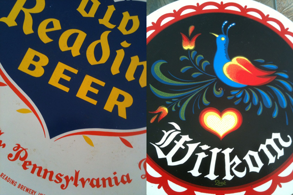
I want to make clear: I'm not grousing about the client making use of copies of work-in-progress. I'm generally in favor of DIY whenever possible. And since my whole design ethos is based on borrowing and adapting, and "leaning heavily upon", it's fun for me, too, to imagine being at different spots in that continuum. This small project, for instance, was based largely upon a couple of references the client provided:
The letters I designed for the painted sign, mimic the Old Reading letters (penciled pattern visible in the upper left corner, here). And in the client's printed version, up top, you'll see he Photoshopped the flowers from the Wilkom rondo, which are what we interpreted in paint, too, for the painted sign. I enjoy collaboration!
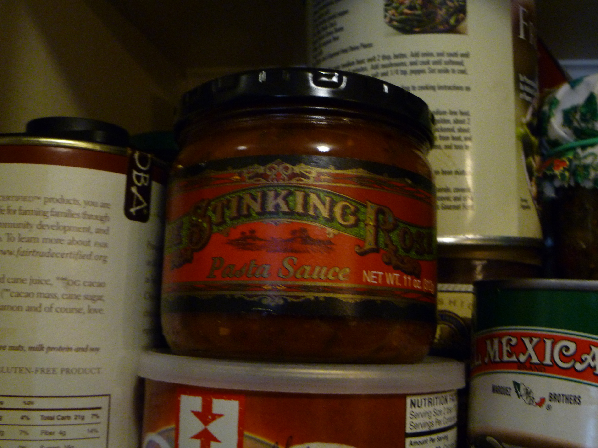
As far as "copying" goes, you may notice all the Flickr images our shop uploads are Creative Commons licensed (i.e. free to use, non-commercially and with proper attribution, and the "non-commercial" clause is certainly negotiable, especially when the end user is our client). It's funny, to me, that I used to pencil in "© NEW BOHEMIA SIGNS", and the year, whenever I'd fax a client a pencil sketch of a design. Nowadays, I think, we're in an interesting time, for which current copyright law is completely inappropriate, but that's another topic, for another blog. Here, if anything, I just wanna mention the glee of surprise, when I see something I did, around town. Often, we'll paint something in the shop, and off it goes, to who knows where; then, months, or years later, I'll be passing through the odd neighborhood, and--hey! I painted that! But it's double weird, when, as above, this happens, not on a storefront, but inside the store, on its shelves. Here's some Stinking Rose pasta sauce, we spotted in a Whole Foods:
And a Far West Fungi box, in Rainbow Grocery:
Of course, when those projects were designed, the clients already had an eye towards those applications. I'd supplied digital files to our clients, with the understanding that they would do as they wish with them. From my humble sign painting origins, I've never been clued in to how I'm supposed to "monetize" print applications, or what a "licensing fee" is. Some tell me I'm missing out on "thousands"! Feel free to clue me in, but be warned: my eyes are already rolling. If you give us a call, ask for the business manager. I'll remind Scott he's the business manager.
In the meantime, buy some pretzels! Besides the 19th and Valencia corner store, you might find them being sold by DJ Lucky from a bicycle basket sporting a painted sign, outside the Elbo Room, on Saturday night soul parties!


