Other Sign Painter Movies

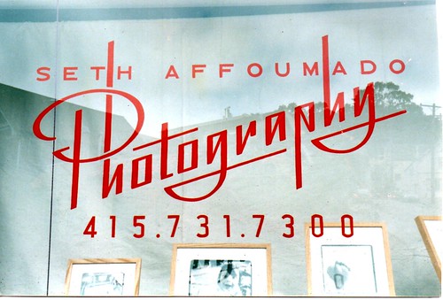
The rumor has popped up a few times, over the past few months, that "The Sign Painter Movie is opening soon, in San Francisco!"  I've emailed Faythe, the co-director, and she promises to let us know if and when that's going to happen.  I.e., not yet! This past week, I was making a window sign, in copper leaf, designed by one of the blokes at Friends of Type, and he mentioned having seen some "9 minute clip" of the movie, that had some footage of New Bohemia Signs in it, too.  I'll have to ask him to send a link, if it's online, because my search for video of "Sign Painter Movie" yielded only these: first, El Letrista, a 3 1/2 minute long Argentinean film, wherein someone leaves a Neuro-psychiatric Hospital, pops some pills, watches a woman put on her shirt, and, between 0:40 and 1:10, brushes out a few letters.  Yo no hablo español, so I'm not sure what's happening, but there's a loud and mournful piano soundtrack. Then there was also this gem:

[vimeo 12848606]

I don't know where in India these painters are, but it's good to see their chops, and interesting to note the parallels in the arc of the industry, on either side of the globe.

If you find that movie interesting, you may want a look at my Flickr set of signs, mostly hand painted, and mostly from the south Indian state of Kerala, taken during our honeymoon, a few years back.  Somewhere in the middle of the set, I meet a sign painter, working on trucks, in Alleppey.  I regret now that I didn't get more pictures of him, but we didn't speak one another's languages, so it was difficult.  I think I communicated that I was in the same line of work... not sure.

There are, actually, a number of other sign painting videos that pop up in the YouTube sidebar for El Letrista.  Let me know if you find one you like.  I enjoyed this one, but I think he should trade piano soundtracks with El Letrista.

Atelier für Malerei

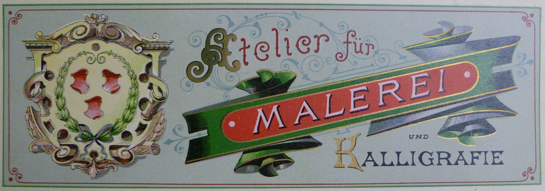
Anna, of Rifle Paper Co., in Florida, wrote up a nice thing or two about us on her blog, a few weeks back.  In the same post, she shared some clips from a book, Der Schriftenmaler, by Wilhelm Arrenbrecht, which was also mentioned, a couple weeks earlier, in the Sign Painter Movie blog.  My attempts to re-translate from Google-translator-ese suggest the book's title means something like "the letter painter".  The book is from around the turn of the 19th-20th centuries, and is on sale from a rare book dealer, for $1,250.

A few years back, a journeyman sign painter, Doug, moved out to San Francisco, after some gigs in, I think, New Jersey, Vermont, and Colorado, and worked with us here, a bit.  Somewhere along his travels, he'd tracked down a similar book, Der Praktische Schildermaler (near as I can tell, "the practical sign painter"), a set of prints by one Hans J. Jedlitschka, for which Doug apparently dropped something not unlike the amount listed above.  He wrote in to a hand letterers' forum, saying that he'd like "to share this book with everyone because of its rarity and beauty", soliciting ideas for how best to do so, and he decided, in the end, to take some decent pictures of the color plates in the collection, and pass CDs of those on to fellow sign painters he met.

He gave me one, and told me I could share it with the letterers in my shop.  Since then, I've urged him to put his pictures of the plates online, for all to see, but he's very resistant to the idea that "sticker hacks" might take these designs and adapt them into vinyl wraps for Honda Civics.  I respect that that's a very valid concern, but I also feel that raising the caliber of design resources available to the sticker hacks of the world might only (if they're even noticed) improve the overall results of their hackery.  I mean, true, you can't teach taste...  But I'm not so interested in dictating taste, for that matter.  I just think this stuff looks cool, and y'all should see it!

So, last week, after admiring Der Schriftenmaler, an impulsive Google search for "der praktische schildermaler" happened to turn up a listing on German ebay, and, being in an impulsive mood, I impulsively clicked "buy now".  It was ridiculously expensive, although not anywhere nearly as ridiculously expensive as listed elsewhere.

Anyway, it showed up this past Thursday, and, yeah, they're some pretty impressive designs.  There are 32 very large plates, loose-bound in a folder, printed in full, rich colors with gold and silver foil (or ink?) accents.  There are a few mars here and there, some of what look like watercolor stains on a couple pages, but that barely diminishes the glory of all the layouts, letter designs, and line work.

What I bought is actually only half of a double set, a total of 64 plates, in Series I and II.  Other than the set of both for sale at the link in the paragraph before last, the only other mention of any copies of Series II that I've seen online is of a set in which only 22 of the 32 plates remain. I just know that if I'd spent whatever they're asking for it, and this plate was missing, I'd be gutted, regardless of whatever other prizes remain in that section.

But regardless, given what I've got, I now have the same question Doug posed to the forum, earlier: what should I do?  I mean, the whole collection is just neat-o keen (to put it mildly), and I don't see a reason to keep it under wraps.  My first thought is to just put good photos of it up as a Flickr set, and whoever wants a look can have it.  But then, having already had photos of these prints on my hard drive for a while now, I'd assert that, alluring as the images are, they're all the more engrossing in a tactile format.  I suspect they'd still retain a good deal of their charm as smaller printed duplicates...

However, even if I were just gonna make available some quick 'n' dirty comb-bound set of Kinko's color photocopies, that's, what, like a dollar a page, right?  So, it'd cost me no less than $32 a set, prob'ly more like $40, with a binding.  And at that price, wouldn't you rather have something a bit more durable than I'm given to believe color Xeroxes might be?

Anyway, print yourself out a page, and tell me if a book of higher res versions of those is worth $40.

I've sent an email to an old sign client, involved in art book publishing, and asked about making some decent quality print version available, as inexpensively as archival quality might allow.  I haven't heard back yet.  I'm hoping they might have some wisdom to impart, not least regarding international copyright, and/or the expiry thereof.  A Googling of the printer, Friedrich Wolfrum and Co., of Vienna and Leipzig, doesn't yield much, beyond a Dover catalog of art nouveau patterns and designs (hmm, maybe I should get hold of Dover?).  Googling "Jedlitschka" indicates there may be some descendants of the artist, in the German film industry.  Not sure.

Leaving those questions aside, maybe I should do myself the favor of getting intimately familiar with each page, and producing vectorized versions thereof--sure to be all the more alluring to the lurking "sticker hacks"...  Along the way, I might put some meat on the bones of my oft-postponed plans to dabble in digital type design.

Anyway, I guess for now I'll just post to Flickr, these mid-res pics from my point 'n' shoot, not bothering with any technical lighting, or whatever it is that makes proper art photos.  I figured the oblique morning light through the living room window will give a little hint of the lustre in the gold and silver bits, although a few of the plates aren't really done justice.  Meanwhile, I'll gather and sort through advice on how they might be best presented.  Maybe just some well-lit hi-res files in a .zip package?  Tell me what you think.  And until someone convinces me I'm a fool to just show everybody, enjoy the photos!
Short sign docs

[vimeo 14985356] I just this morning came across Anna Lena Schiller's recent blog post, compiling a few short films about sign painters, on three continents.  I'm happy to find myself in there, but I'm really thrilled to see this short film about David Smith.  I met him a few years ago, at a gilders' meet, at Larry White's, in Fremont, where I bought from him one of the "Smith Tips" he talks about having invented, at about 4 minutes in.  Then, at about 11 minutes in, during a segment wherein he's gilding glass, omg, that's just like I do it!, he's talking about, "before this craft dies out, I've got to teach as many people as I can, get 'em interested, just to keep it alive".

I feel a bit like a chump, or a hack, in this guy's company.  But I also feel like I can create a space here, where some kid's gonna come along, and find the environment conducive toward blossoming into the next generation's David Smith, or Rick Glawson (who David mentions, and who passed away a week before I'd scheduled a trip to Wilmington to meet him).  I can maybe serve as some kind of conduit between greatnesses, yeah?

Also, re: Anna Lena, above, it looks like she's in a line of work producing something like the pretty delightful RSA Animate videos I've been enjoying in recent months.  Bear it in mind, if you're in need of any "visual sensemaking".

On the shelves

I was a little surprised, when I popped into my corner grocery for a beer, this past lovely summer Sunday afternoon (ah, the joy of SF summer in October!), to see a sign I'd designed, over the counter, selling pretzels:

Actually, that's not really the sign I designed.  Mine had a slightly different, easier to read "modern"-ized version of the Blackletter you see here, and some little pretzel twists in the corners... and a chalkboard panel where the price goes.  That sign, above, is one our client put together from a color mock-up I'd emailed him, for layout approval (along with a pencil sketch of the letter designs), like so:

And that, I further refined to this, which is what got re-purposed into what you see above:

Of course, despite my recent flurry of pictorial activity, I managed to neglect to snap any shots of the sign we finally painted.  In fact, I did manage to get a shot of us painting the wrong letters, which I insisted we black out and re-do.  (This happened because [a] I generally stalk about the shop in a paint-fume-fed haze of ignorance; and [b] I printed out the outlines of that color layout to use as a guide for letter placement in drawing new letters, but also as a pattern for the simpler block letter portions of the sign--this being illustrative of our tenuous stance on the slippery slope above Digital Hell!)

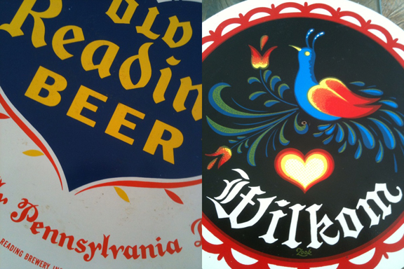
I want to make clear: I'm not grousing about the client making use of copies of work-in-progress.  I'm generally in favor of DIY whenever possible.  And since my whole design ethos is based on borrowing and adapting, and "leaning heavily upon", it's fun for me, too, to imagine being at different spots in that continuum.  This small project, for instance, was based largely upon a couple of references the client provided:

The letters I designed for the painted sign, mimic the Old Reading letters (penciled pattern visible in the upper left corner, here).  And in the client's printed version, up top, you'll see he Photoshopped the flowers from the Wilkom rondo, which are what we interpreted in paint, too, for the painted sign. I enjoy collaboration!

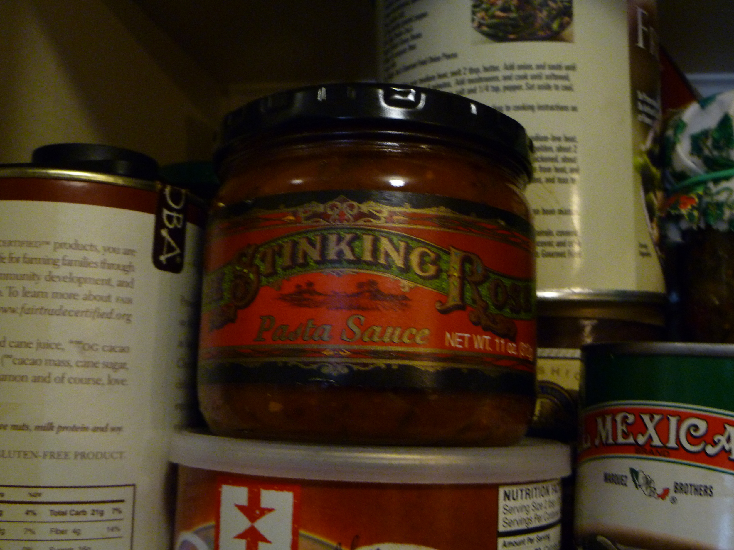
As far as "copying" goes, you may notice all the Flickr images our shop uploads are Creative Commons licensed (i.e. free to use, non-commercially and with proper attribution, and the "non-commercial" clause is certainly negotiable, especially when the end user is our client).  It's funny, to me, that I used to pencil in "© NEW BOHEMIA SIGNS", and the year, whenever I'd fax a client a pencil sketch of a design.  Nowadays, I think, we're in an interesting time, for which current copyright law is completely inappropriate, but that's another topic, for another blog.  Here, if anything, I just wanna mention the glee of surprise, when I see something I did, around town.  Often, we'll paint something in the shop, and off it goes, to who knows where; then, months, or years later, I'll be passing through the odd neighborhood, and--hey! I painted that!  But it's double weird, when, as above, this happens, not on a storefront, but inside the store, on its shelves.  Here's some Stinking Rose pasta sauce, we spotted in a Whole Foods:

And a Far West Fungi box, in Rainbow Grocery:

Of course, when those projects were designed, the clients already had an eye towards those applications.  I'd supplied digital files to our clients, with the understanding that they would do as they wish with them.  From my humble sign painting origins, I've never been clued in to how I'm supposed to "monetize" print applications, or what a "licensing fee" is.  Some tell me I'm missing out on "thousands"!  Feel free to clue me in, but be warned: my eyes are already rolling.  If you give us a call, ask for the business manager.  I'll remind Scott he's the business manager.

In the meantime, buy some pretzels!  Besides the 19th and Valencia corner store, you might find them being sold by DJ Lucky from a bicycle basket sporting a painted sign, outside the Elbo Room, on Saturday night soul parties!

Different Fur

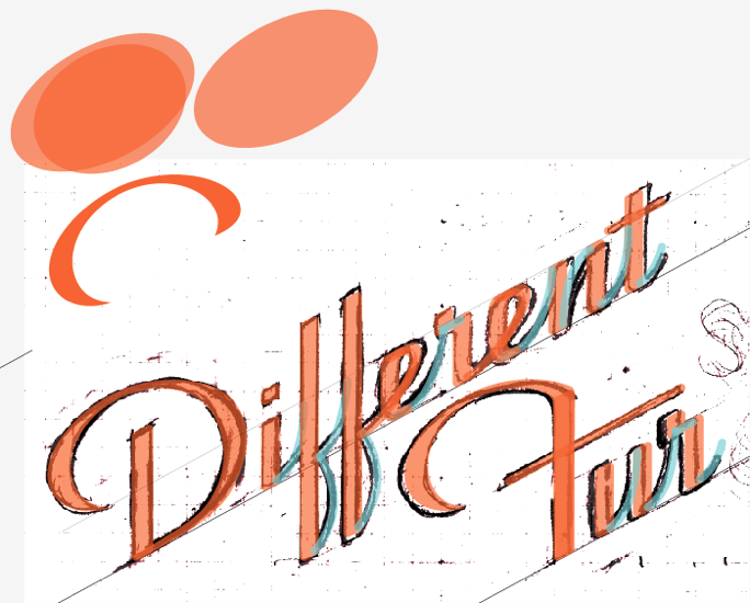
Had a gig recently, designing a new logo/brand identity for Different Fur, a recording studio that has been tucked away in a nondescript residential-looking space along 19th Street for something like 40 years.  Patrick, the owner (who worked his way up from assistant studio hand), showed me a bunch of examples of styles he liked, some of which he'd pulled out of the New Bohemia Signs Flickr set.  He pointed out an old logo of theirs they liked (which you can see atop their website/blog, at least for the time being), but wanted to update, while still keeping something of its deco style.  He wanted it to communicate "establishment", the fact that they've been there a long time, and aren't going away.  Maybe a little monumental.  "Not a hobby", at any rate. I wrote "nondescript" above, but I remember, some years ago, and for I dunno how many years prior, the front door of their white building was emblazoned with a giant stylized barking dog's head.  They preferred not to directly reference fur and/or animals anymore.

I did some sketches:

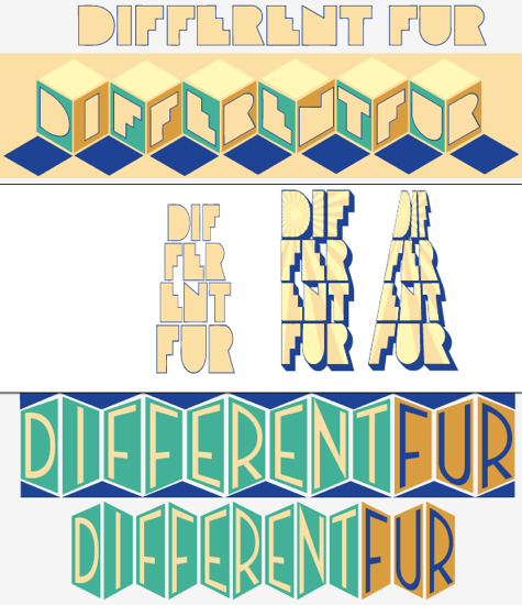
I played around a bit with their old logo, and digitizing some of the sketch ideas:

Meh.

I came up with a letter style I liked, and tried a few permutations of that:

We met again, for dinner, and talked a bit more in depth, Patrick flipping through my sketch book.  We talked about how he'd also like to have a monogram version of the logo, and how he was envisioning some kind of geometric shape involved, maybe a diamond.  I played around with that a bit, and sent him these:

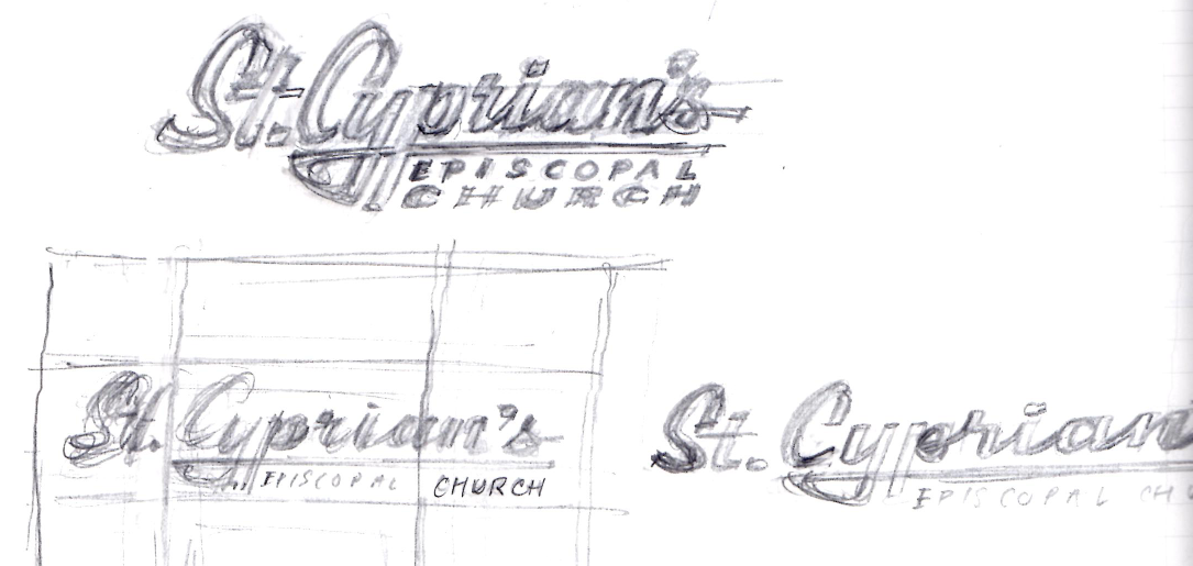
But he'd also seen this sketch I'd done for St. Cyprian's church, a few months back, and was curious to see something in a script style:

So, I drew these, after flipping through that Steven Heller book I'd recently bought, on mid-century modern storefront design:

And that last one was a hit! Which, frankly, I found exciting, 'cause I based it 'round this design I did, almost a decade ago, and loved, for a storefront that's unfortunately no longer around:

The other day, I was flipping through a stack of old Kodak prints, looking for a picture of another old sign we'd done, for reference on a different job, and came across this tattered old shot of me painting that sign:

I remember carving a linoleum block from that image, thinking I might block print advertising postcards, but carving the block was about as far as my advertising head of steam got me:

Print your own!

Anyway, back to the matter at hand:  I refined my sketch of that last design, scanned it in, and started letter building:

And, bingo, bang-o, long story short, I slapped together some variations, they picked some, and we're done!

I used an existing font for "studios", Union Thug, from Letterhead.

Next, we'll be working on a sign based on this, with some gilding involved.  They're having a kind of "coming out" party, next month, once they're (mostly) done remodeling the place, so we needed to have this bit ready for printing invitations and press materials.  Voila!